
Allshelter
Transforming complex technical documents into a cohesive brand experience.
Industry Container Shelters & Industrial Structures
Scope User Manuals (USA & Australia), Product Catalogue Design, Market Adaptation

The Challenge
Allshelter had a strong product range but their supporting materials told a different story.
Their user manuals for the US market were a mix of outdated Word documents and PDFs, inconsistent in layout, tone, and branding.
They needed a complete suite of manuals and a refreshed catalogue that not only aligned with their brand but made information easier to navigate for customers and distributors. The new designs also needed to adapt for the US market while maintaining consistency with the Australian brand system.
The Solution
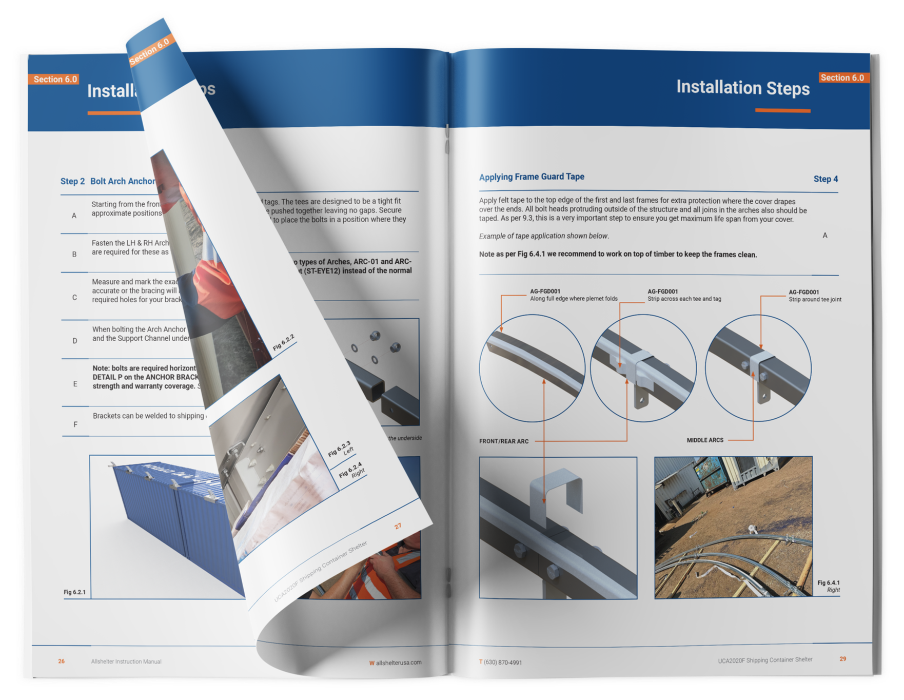
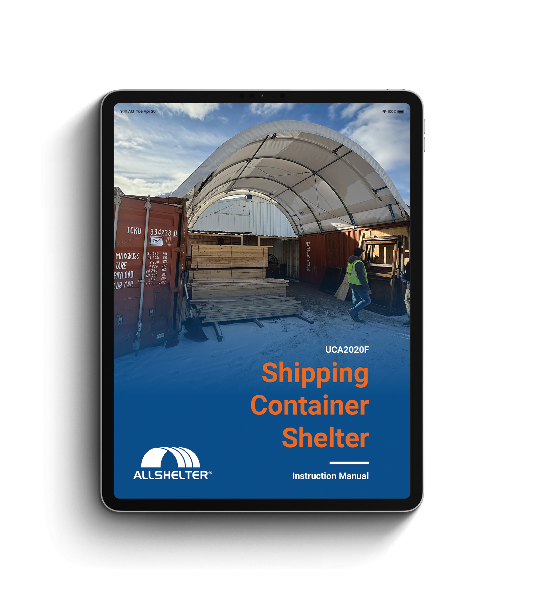
Working closely with the Allshelter team, I designed a full suite of 13 user manuals across their Shelter, Indwell, Doors, and Accessories product range for the US market. Each manual was restructured with clear hierarchy, improved legibility, and a professional visual system that reflected their brand.
Following this, I created a 28-page product catalogue for their US market, expanding content to include new product lines while maintaining design continuity. The success of this rollout led to a second phase: adapting and completing the full suite of manuals for the Australian range, ensuring a consistent global brand experience.
The Result
Allshelter’s new documentation system now reflects the strength and professionalism of their products. The manuals and catalogue are easier to update, faster to produce, and consistently on-brand across two markets.

This was a really positive experience, with clear communication and quick turnaround. Nat just took our information and worked her magic.

Russell Reddel
Director, Ground Nurse