
Western Sydney Wanderers FC
Season 2019/20 Outdoor Advertising Campaign
Breaking the rules of consistency to build a season-long visual identity that demanded attention.
Industry Sport, Football
Scope Outdoor advertising, posters
Reimagining what consistency means for a football brand.
A bold, season-long outdoor campaign for Western Sydney Wanderers FC that broke the rules of uniformity.
Each round told a new story — cinematic, expressive, and visually distinct — yet tied together by one unmistakable identity.

The Challenge
The Wanderers needed a campaign that would reignite fan excitement for their return to Wanderland and keep audiences engaged throughout the 2019/20 A-League season.
Each match required its own creative energy — bold, unexpected, and designed to stand out across Sydney’s streets.
The challenge was to connect these individual campaigns under one cohesive visual language without sacrificing originality.


The Solution
I designed a season-long series of outdoor advertising campaigns for each home match, using typography and tone as the connective thread.
While every round drew inspiration from different creative worlds — from cinema to print — each shared the same typographic rhythm and colour palette, creating cohesion without conformity.
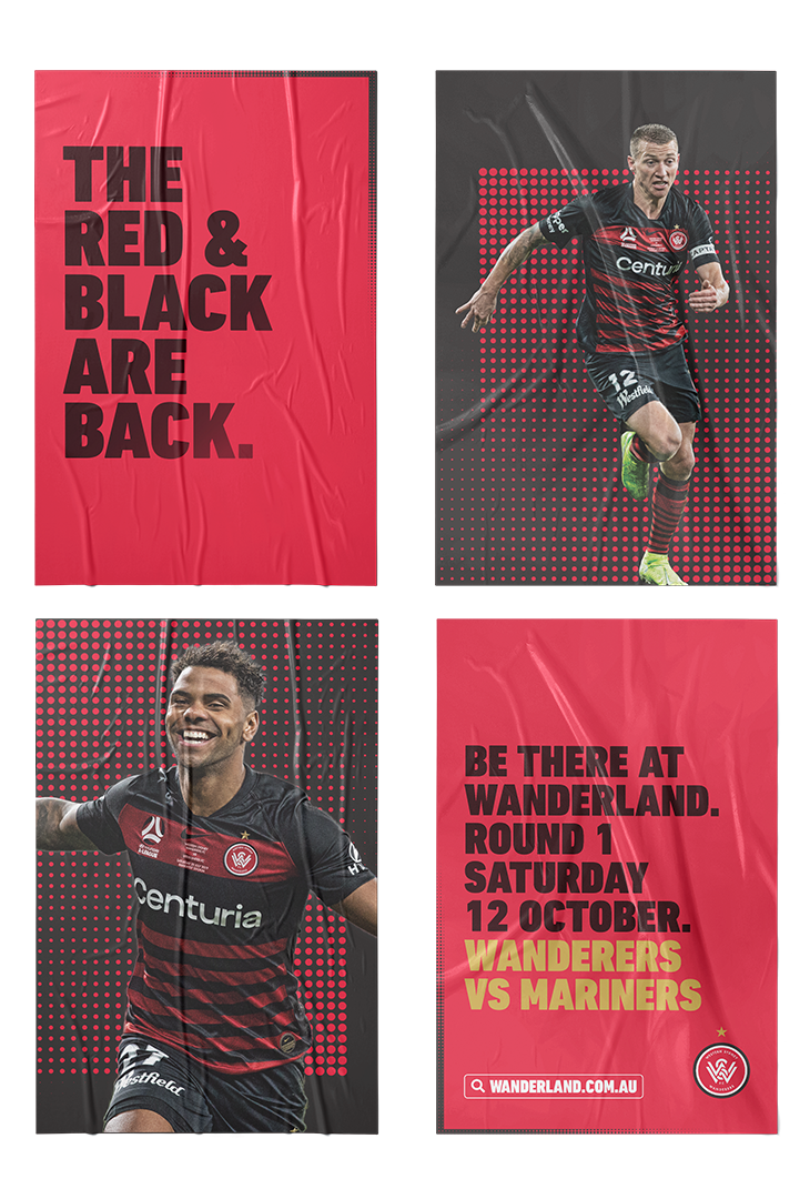
Round 1: A return to Wanderland — launch posters introducing the season and rallying fans for the first match.
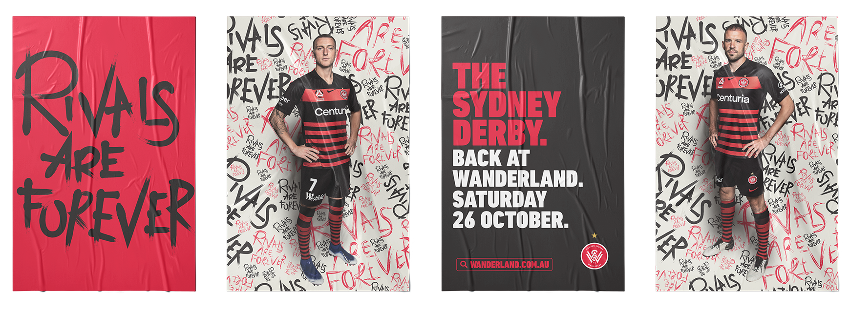
Round 3: Rivals Are Forever — inspired by The Shining, this series created a bold, menacing identity for the Sydney Derby.
Round 7: Comic book and pulp magazine styling brought high energy and playful tension to player-driven posters.
Round 13: Vintage newspaper headlines tied into the new year with a nostalgic, typographic twist.
Round 20: Bauhaus and Japanese typography influences created structure and clarity mid-season.
Round 24: The second Sydney Derby campaign used member postcodes and collage design to celebrate the supporters who make the rivalry iconic.

The Result
The campaign gave the club a fresh, flexible design system that felt as unpredictable and alive as the season itself.
It broke from standard football advertising and set the tone for how the Wanderers could evolve creatively in future seasons.